

intro
Summer Mixtape is a personal design experiment rooted in music, nostalgia, and analog media. Inspired by the cassette tapes I grew up on, this project reimagines the feeling of discovering analog media for the first time.
The initial concept was to create something that felt like a lost artifact from the early ’80s. A mixtape you might find tucked inside an old backpack or glovebox.
start

Early visual sketch exploring tone, layout, and visual references.
research
& development
This phase included:
Cassette Formatting: Studied J-card layouts + inlay design for tracklist flow and spine hierarchy.
Alt/Emo Label References: Pulled inspiration from Victory, Rise, and Epitaph — emotional design, bold contrast, and handwritten elements.
DIY Texture: Researched risograph, xeroxed tour flyers, and lo-fi merch — drove use of halftones, grain overlays, and bitmap distortion.

design
& build
Once the vision was fully formed, I moved into the production phase, where every part of the cassette, from its layout to its sound, was built by hand.
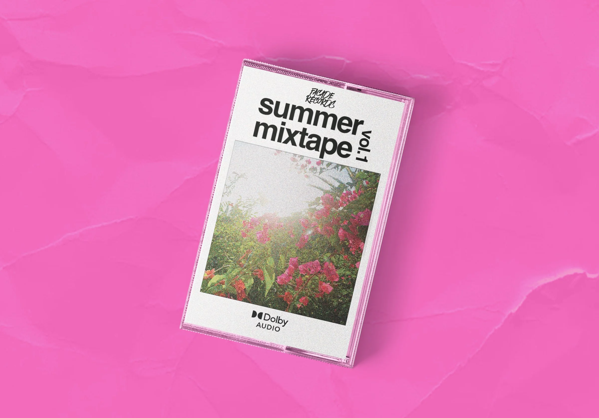
Physical Design
Using Adobe Photoshop, I designed both the J-cards and cassette labels, applying visual techniques inspired by early-2000s label aesthetics — including bitmap textures, minimal grid systems, and type-lockups reminiscent of Victory and Epitaph releases.
Manual Production
Once printed, I manually trimmed each J-card to fit standard cassette cases. Labels were printed on sticker sheets and applied by hand — maintaining a DIY, tactile authenticity that mirrors the era the design pays homage to.


branding


Faux Record Label Logo
Designed to evoke the aesthetic of the 2010s alternative music scene — raw, bold, and scene-driven.


Project Logo — Summer Mixtape Vol. 1
Set in Helvetica Neue, a typeface widely embraced by the 2010s alternative scene. Bands like Thrice, and Bring Me the Horizon used it across album art and merch — giving this project an authentic visual anchor within that world.
typography


brand in action

Billboard Mockup: Outdoor Campaign
A bold, print-inspired rollout for Summer Mixtape Vol.1. The layout combines strong type, analog textures, and product visuals to evoke a real-world, street-level release. Designed to feel like a wheat-pasted announcement you'd spot in the wild.

Street Poster Mockup
A visual extension of the Summer Mixtape campaign, designed to feel like a real poster you'd find pasted in the city. This mockup pairs bold type with physical texture, a simple CTA, and QR integration to ground the concept in the real world.

Merch Mockup: Graphic Tee
A limited-edition T-shirt designed to extend the Summer Mixtape Vol.1 campaign into wearable form. The circular type and cassette graphic nod to physical media culture, while the branded neck tag reinforces the Facade Records identity.

Merch Mockup: Embroidered Hat
A minimalist cap design showcasing the Facade Records identity through a compact cassette icon and hand-lettered logo. A subtle but wearable piece that reinforces the analog ethos of the Summer Mixtape campaign.

Instagram Post: Pre-release Teaser
Social rollout builds anticipation with coordinated story highlights, brand-aligned visuals, and short-form copy designed for scroll-stopping impact.

