Project
Overview
What is
Tech Forge?
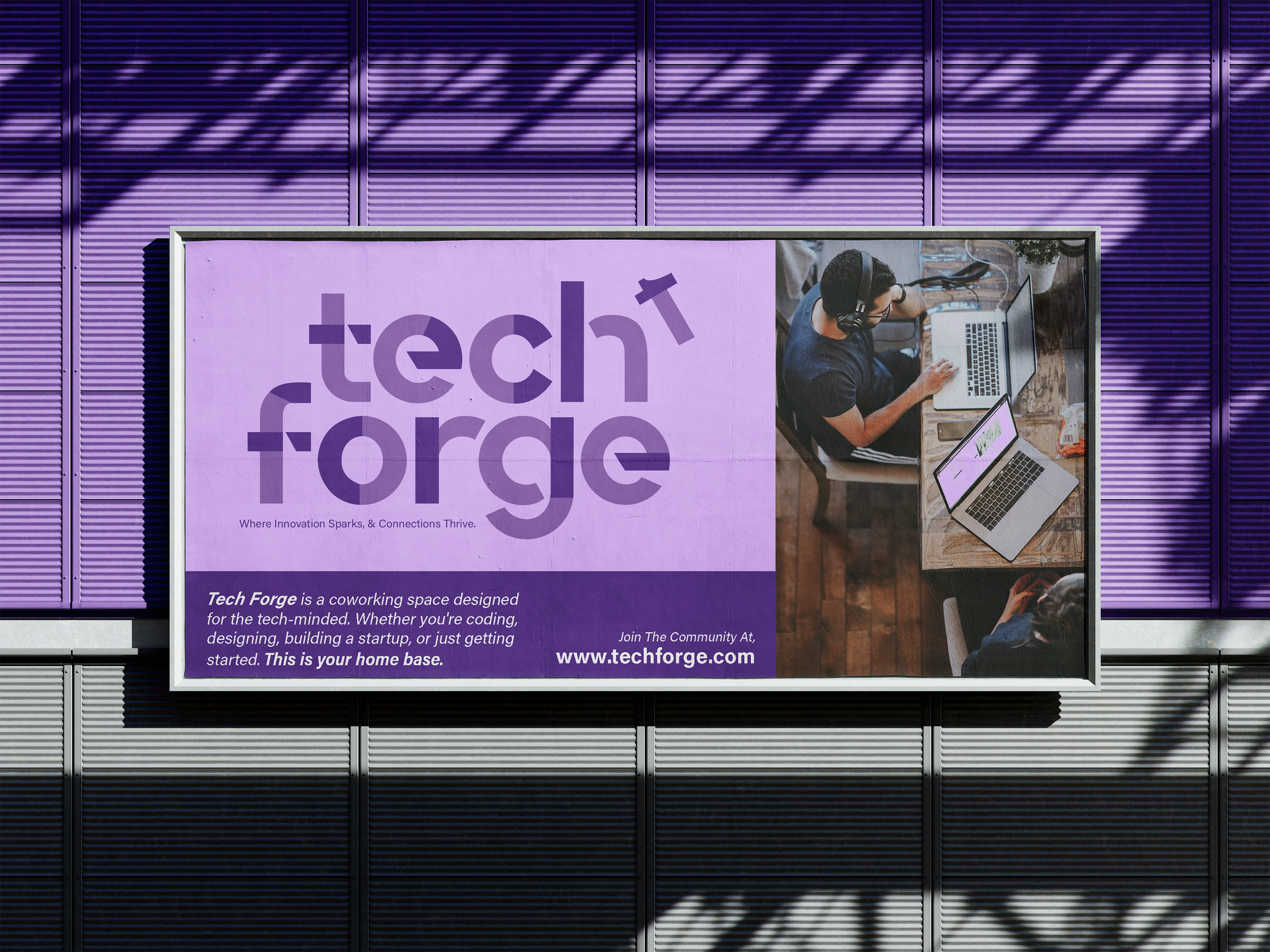
Tech Forge is a conceptual coworking brand built for coders, creators, and startups pushing the boundaries of technology. The brand was designed to reflect the spirit of innovation, collaboration, and digital craftsmanship.
Logo Design

1. Full Lockup
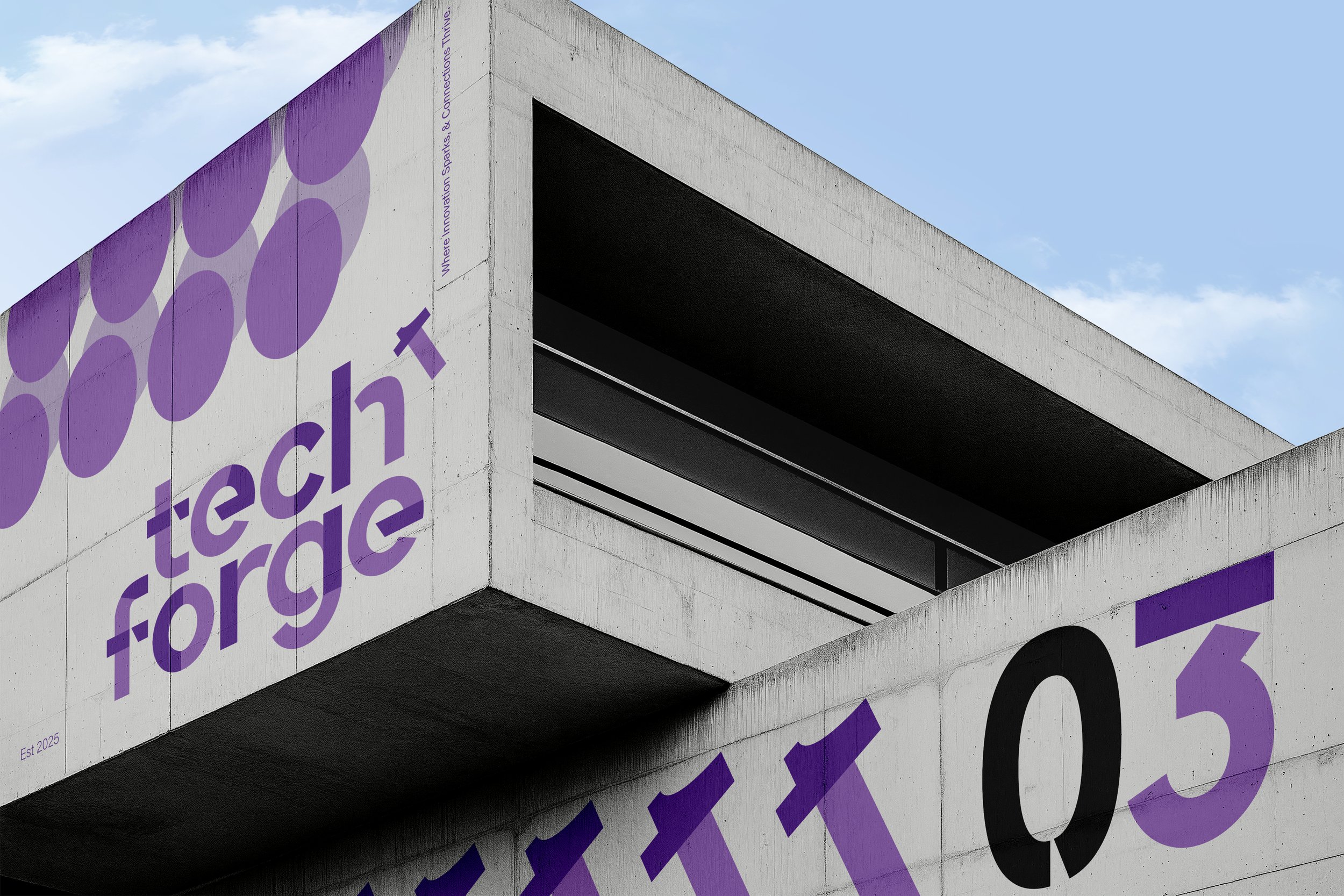
The primary Tech Forge logo is built from modular, geometric letterforms that feel both industrial and contemporary.

2. Cropped Detail
Zooming into the forms reveals the logic behind the typography. These design choices create rhythm and cohesion across the brand, while also reinforcing the core values of structure, innovation, and hands-on creativity.

3. Hammer Symbol
Serving as a standalone mark, the hammer icon distills the brand’s philosophy into a single visual:
Color Palette
Forged in Monochrome
The Tech Forge palette embraces a bold, monochromatic approach—balancing creativity and control through shades of purple. Each tone plays a role in expressing the brand’s duality: imaginative yet structured, modern yet timeless.
#562D86 — The anchor. A rich violet symbolizing technical depth and creative intensity. Used in headers, iconography, and the core logomark.
#8962A8 — The complement. A lighter purple that softens the visual system without sacrificing strength. Often used for backgrounds, accents, and modular overlays.
#FFFFFF — Breath. Negative space and digital clarity, essential for clean layouts and legible contrast.
#000000 — Grounding force. Used sparingly for hierarchy, framing, and moments that need weight.
Why Monochrome?
Going monochrome reinforces the brand’s precision and cohesion. In a space full of colorful startups, Tech Forge stands out by embracing discipline—letting geometry, typography, and iconography carry the visual energy.